How to Teach Kids About Color Theory (A Guide for Beginners)
Color theory is a visual art concept that can help students learn how to combine colors effectively in their artwork, as well as how to harmonize the color scheme with the rest of the work.
If you are an art teacher and your students need help learning about color theory, this guide can teach you how to teach them. But even if you aren’t an art teacher, color theory can be useful in any kind of art-related, creative project. Think: regular education endeavors that require a creative process! These tips will help your students find success in any classroom.
If you are a teacher, parent, or anyone who knows a budding artist who you want to learn more about color theory...this post is for you!

What is Color Theory?
Color theory is a set of ideas that explain how colors relate and work together. Basically, it’s about matching colors well so they go together in an intentional and effective way. Color theory is an essential tool in communicating visually.
Now, let me tell you about Johannes Itten.
This fella was a pivotal member of the Bauhaus. If you are unfamiliar with Bauhaus, Germany’s most influential art and design school, you have a delightful internet black hole to fall into after you finish reading this post. Seriously, go look it up.
For now, let's keep it simple. The Bauhaus was founded in 1919 and closed in 1933 under the threat of the Fascist party. The Bauhaus School primarily focused on expressionist art, design, and architecture. From 1919 to 1923, Itten was the main painter at the institution and taught a required introductory course that focused on form and color.
The theories he developed and taught at Bauhaus are still practiced by artists today and can be super useful for beginning artists. This is why I want to outline his work here, for teachers and parents of budding creatives and artists.
So, believe it or not, Itten’s color wheel was a departure from the color wheels widely used at his time. Many contained too few or too many colors. This made it difficult to find connections between the colors. It also made it too complicated to teach students to apply practically. Itten’s wheel only contained twelve colors: the three primary colors, the three secondary, and the six tertiary colors.
Primary, Secondary, and Tertiary Colors
The primary colors of a color wheel are red, blue, and yellow. They are primary because they cannot be made by mixing other colors.
Secondary colors are green, purple, and orange. These can be made by mixing two primary colors together in equal amounts. Equal is an important word here. If the amounts mixed are unequal, the actual color changes. So, for true secondary colors, equal amounts have to be combined.
Green is made by mixing blue and yellow, orange is made by mixing red and yellow, and purple is made by mixing red and blue.
Tertiary colors can be made by mixing a primary and secondary color together. To make a tertiary color, the equal concept also applies. For example: red (primary) + orange (secondary) = red - orange. This can also be written as R + O = RO. I like this naming system because putting the primary color first speaks to its prominence in the tertiary color. Think about it! RO is one full part red, while orange is half red and half yellow. So, technically, RO is 3/4 red. (1/2 R + 1/2 O = 1/2 R + 1/4 R + 1/4 Y...Wanna integrate math into you color theory? Lt's talk about that later.) Anyway, you can use any notation /naming system you like—as long as it makes sense to you!

Qualities of Color
There are basically four “qualities” of a color: hue, intensity, value, and temperature. Let's define these.
Hue is generally just the source color, one of the twelve colors on the (Itten's) color wheel. Knowing the source color or hue allows us to mix a color using a basic palette. We tend to use the word hue and color interchangeably. For example, red is a color..red is a hue. It isn't technically incorrect to interchange these terms. However, more precisely, hue to the colors of the visual spectrum — red, orange, yellow, green, blue, and violet. Then, those hues can be blended into almost infinite numbers of colors. Since black and white are not part of the visible spectrum, they are not technically considered hues.
Value is the lightness or darkness of the color relative to white, black, and gray. When you take one of the hues (like, blue) and add white or black to it, you manipulate the value. Respectively, you will get tints which look lighter; and shades which look darker than their source hue. This is one reason I say equal is important in mixing secondary and tertiary colors. Unequal parts can change the value in much the the same way white and black can.
Intensity is the brightness or dullness of a color, often determined by the amount of white or complementary color that has been mixed with it. We tend to use the words chroma and saturation are used interchangeably with intensity.
Temperature is idea of a color being “warm” or “cool.” Warm colors reside on one side of the color wheel while cool colors reside on the opposite side. This is Itten's terminology that is still used by artists today.

7 Methods of Contrast
Now, here is the meaty part of this post. I'm so excited about this because I think this will be a relatively new concept for arts educators, specifically at the elementary level. These have the potential to revolutionize how you are teaching about color in your classrooms! I know these did that for me. I've included some of my favorite examples that exhibit these methods of contrast.
1. The complementary contrast employs complementary colors. Complementary colors are directly opposite each other on a color wheel. Red and green, blue and orange—you get it. By pairing complementary colors together, you create vibrant contrasts that will have your eyes popping like fireworks. (City Picture by Paul Klee)
2. A contrast of hue, or color, is super easy to identify. It is quite literally just placing different colors next to each other. Note that the intensity of the contrast of hue diminishes as the hues move farther away from the primary colors. (Lamentation Over the Dead Christ by Sandro Botichelli)
3. Contrast of warm and cool is created when colors that are considered “warm” or “cool” (as defined by Itten, think: east and west hemispheres of the color wheel) are used together. Itten determined that warm colors evoke feelings of warmth and comfort while cool colors are associated with sadness or melancholy. Warm colors also appear to move forward, while cool colors recede into the background. (The Artist’s Son and Sister in the Garden at Sevres by Marie Bracquemond)
4. Contrast of light and dark is created when light and dark values of a color are used together. (The Storm on the Sea of Galilee by Rembrandt)
5. The contrast of saturation is the use of pure, intense colors and dull colors together. (Prisoners Exercising by Vincent van Gogh)
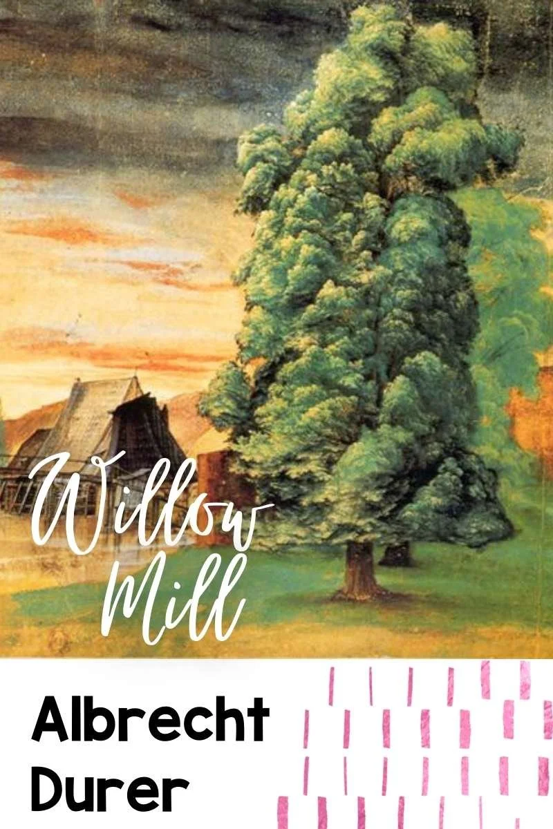
6. The contrast of proportion is based on two or more areas of color that cover differing areas, such as large and small, or much and little. (Willow Mill by Albrecht Durer)
7. Simultaneous contrast is created when opposing colors are placed next to each other. creating the illusion of vibrations or shadows. One color can change how we perceive the tone and hue of another when the two are placed side by side. The actual colors don't really change, but we see them differently. (The 14th of July Celebration in Paris by Vincent van Gogh)


A Mini-lesson to Get Started
Teaching kids about color theory is a great way for them to learn about mixing, matching, and creating their own styles of art. While there are plenty of books and online resources out there that can teach kids basic color theory, it can be just as much fun to let them play around with it themselves.
Here are some ideas on how you can start your first art lesson on color theory: You’ll need an assortment of colored pencils or crayons—5-10 per student should do. These can range from soft pastels to vibrant markers and crayons, so be sure to check what works best with your students; if they’re old enough, give them a choice! Get some paper—newsprint works well since it’s cheap, but almost any paper will do. Have them fold the paper to create at least 6 rectangles. Then have them fill in each with different colors by randomly drawing lines all over until every inch is covered in scribbles. Cut the rectangles apart. After letting them dry overnight if needed, have students sort these into piles based on the 7 Contrasts. They should also justify the reasoning for each placement. This will give them practice identifying these concepts and you will be able to assess their knowledge informally.
What other ideas do you have for teaching and using these concepts with students and kiddos? Let me know! I look forward to hearing from you!